Select date

Vaccine Evangelists, Apostates, and Apologists: Part 3 — The Red Herring: A Tour of the Motte


This is the third installment of this essay series. You can read Part 1. The Evangelists at this link, and Part 2. Apostasy at this link.
I ended Part 2 with the following description for what’s in store in this essay – Part 3. Here’s how we ended the last essay.
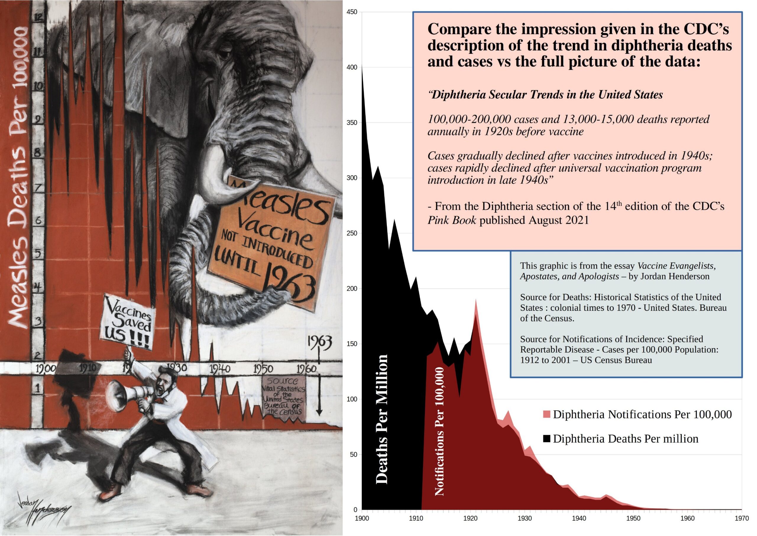
“In the imagery of the Motte and Bailey analogy, the desirable Bailey has been stormed: the Vaccine Apostates knocked over the flimsy palisade, pushed aside a drunken guard or two and took the Bailey.
The Vaccine Apostates accomplished this, as we just saw, by showing us the death data, thereby debunking the belief promoted by the Vaccine Evangelists.
So at this point the Vaccine Apologists lead the retreat into their stronghold, the Motte (comprised primarily of notifications of incidence data), pretend that the Evangelists had never been preaching out in the Bailey to begin with, and accuse the Apostates of attacking a strawman for having stormed the Bailey where their colleagues, the evangelists, had just been preaching.
For Part 3, we’ll focus on notification of incidence data, so that we are familiar with the vaccinationist’s stronghold, and how they use it as a decoy or red herring to get attention off of the death data.”
Through the lens of the Motte and Bailey analogy; the desirable Bailey is the death data, but the death data doesn’t support the Vaccine Evangelists’ message, so when challenged, the Vaccinationists have to retreat to a less desirable but more defensible position based on notification of incidence data (data of reported incidence of diseases. This type of data is also called variously just notifications, incidence, and morbidity).
Before we take a close look at notification of incidence data and how Vaccine Apologists use it to get attention off the death data, let’s briefly recap where we’ve been (feel free to skip to the end of the recap if the first two essay installments are fresh in your mind):
Part 1. The Evangelists provided:
- An overview of the vaccine conflict regarding the undue credit given vaccines.
- Analogies by which to understand the dynamic within the conflict (Bait and Switch Confidence Games and Motte and Bailey Doctrines).
- Terminology – Mortality, Death, Morbidity, Notification of Incidence
- An exhibition of Vaccine Evangelist preaching divided into exhibits of the Graveyard Gambit, Bait and Switch Preaching, and the Lifespan Lecture. All these exhibits demonstrated the belief in, and promotion of, the central misconception of the Doctrine of Salvation Through Vaccination.*
(*The belief that vaccines played a primary role in the drastic reduction of deaths attributed to infectious diseases in general, and many major diseases in particular, that occurred in the late 19th and early 20th centuries; and the corollary belief that, these diseases would return with comparable devastation if we stopped vaccination against them.)
Part 2: Apostasy pointed out that both Vaccine Evangelists and Apostates use historical mortality (death) data to make their case, with the revealing difference that Evangelists tell you about the death data, whereas Apostates show it to you.
Then we reviewed the death data for numerous diseases across the English-speaking world to see how the Vaccine Apostates have debunked the Evangelist’s preaching by showing us the death data that the Evangelists only told us about.
~ End of Recap ~
To give you the full experience of the Motte, I want you to get the initial tour from one of the Vaccine Apologists themselves. An excellent case example of Vaccine Apologetics that provides a fairly extensive tour of the Motte is Isabella B’s 2015 article Graphical Proof that Vaccines Work. (The link I provided is to the article published on Medium. For good measure here is another link to the same article as an archive on Archive.is.)
Please consider reading Isabella B’s article in full before reading the rest of this essay. I will be deconstructing Isabella B’s article momentarily, and I do not want to ruin for you the full experience of her skillfully argued and clever article; it would be a shame if you didn’t get to first feel the persuasive power of that type of vaccine apologetics, before seeing it deconstructed.
(While I had initially planned on grouping all of my deconstruction of the Vaccine Apologist’s work into Part 6, and 7 of this series, and the appendices, I will deconstruct Isabella’s Graphical Proof that Vaccines Work in this installment; the rest though, I will deconstruct in part 6, 7 and the appendices as originally planned.)
Did you just get back from reading Isabella B’s article? The first reader of this essay found it a little frustrating that I didn’t seem to be in any hurry to get around to deconstructing Isabella’s article and instead spent so much time reviewing dull notifications of incidence data in this essay.
So I’ll take that as a cue that I had better emphasize how this essay is laid out and why: The first two sections of this essay installment are all about exploring the notification of incidence data and understanding the numerous and major differences between notification of incidence data and death data.
I know that familiarizing ourselves with notification of incidence data, and the differences between it and death data, isn’t exactly glamorous, but it is an important step if we are going to have the necessary knowledge base needed to see straight through the Vaccine Apologists.
The notification of incidence data isn’t just a critical part of Isabella’s article, it is a critical part of nearly all the Vaccine Apologetics aimed at dismissing the death data and graphical evidence based on death data such as the information we reviewed in Part 2 Apostasy; the Vaccine Apologists almost invariably retreat into the notifications of incidence data, it is their Motte.
Let me emphasize; I know notifications of incidence data is dull. In terms of evaluating actual disease prevalence much of this type of data is garbage. In terms of debunking the Vaccine Evangelist’s most grandiose preaching, and dispelling the central misconception of the Doctrine of Salvation Through Vaccination the notification of incidence data is irrelevant. I’m not spending this time looking at this throw away notifications of incidence data because I care about it, and I’m not doing it to be mean and cruel to the reader.
I’m walking the reader through this data because this is where the Vaccine Apologists retreat to, and this is the data they use to get your attention off the exciting, consequential, ever so relevant death data. I believe we need to understand and study our opponent’s rhetorical maneuvers, even if their rhetorical maneuvers are based on something as lame as notifications of incidence data.
Then, in the third through sixth sections of this essay installment, we do the glamorous and exciting work of deconstructing vaccine apologetics with the deconstruction of our first case example: Isabella B’s Graphical Proof that Vaccines Work.
The seventh section sums up this installment.
If you’re eager to skip past the notifications of incident data and jump straight to my deconstruction of Isabella’s article, go ahead (I can’t stop you anyways!), but please do consider coming back later and reading the first two sections of this essay installment so that you are familiar with these matters in preparation for the extensive deconstruction of the other Vaccine Apologists beginning at the sixth installment.
Let’s begin as before with a table of contents of this next installment of the essay series so that you can see where we’re going at a glance.
Table of Contents of Part 3
- Graphs of the Notifications of Incidence Data – Case Example: Measles
- United States
- England and Wales
- Australia
- Spain
- An Honest Appraisal of the Weakness and Unreliability of Notifications of Incidence Data Straight from a Vaccine Apologist
- Differences Between Mortality and Morbidity Data Revisited
- Difference in Relevance
- Difference in Gravity/Severity
- Difference in Completeness
- Difference in Availability
- Difference in Value for Indicating Severity of a Disease
- Case Example #1 of Vaccine Apologetics – Isabella B’s “Graphical Proof that Vaccines Work”
- General Criticism of “Graphical Proof that Vaccines Work”
- Lack of Documentation of the Positions Being Attacked
- Repeatedly Commits Post Hoc Fallacy
- Point-by-Point Deconstruction of Isabella B’s “Graphical Proof that Vaccines Work” and Identification of the Rhetorical Maneuvers Employed Therein
- The section under “Disease incidence is the correct metric” is misdirection
- The section under “Mortality rates do not reflect the true burden of the disease” employs the argument from the data we don’t have
- The section under “Numerous factors affect mortality rates” is unclear but contains probable: projection, doubles down on misdirection, has a false premise, and has an improbable and unsubstantiated implied premise
- The section under “Mortality rates are not more accurate than morbidity rates” is based on misrepresentation of the opposition’s arguments
- Fails to substantiate a strong assertion
- Critical Review of the Graphs in “Graphical Proof that Vaccines Work”
- The Diphtheria Notifications Graph
- CDC Diphtheria Deception Revisited
- The Whooping Cough Notifications Graph
- Conclusion: The Motte is a Red Herring
Note: the labeling of graphs, exhibits, and case examples, in this essay series is continuous with each essay picking up where the other left off. We left off last essay at figure 15; here we start with figure 16.
1 – Graphs for Notifications of Incidence Data – Case Example: Measles
Some notification of incidence data is favorable to the vaccinationists.
In general, measles notification of incidence data is one of the most favorable historical data sets to the vaccinationists. I will be generous to our vaccinationist friends and use measles notifications of incidence as the case example.
Figure 16
 United States measles mortality rate with 1/35 measles disease rate from 1900 to 1987. (Vital Statistics of the United States 1937, 1938, 1943, 1944, 1949, 1960, 1967, 1976, 1987, 1992; Historical Statistics of the United States—Colonial Times to 1970 Part 1)
In the graph above (from Dissolving Illusions) we can see measles death (mortality) and notifications of incidence data simultaneously. Note that the notifications data is at 1/35th scale. This allows you to compare the two trends on the same graph; multiply the morbidity (black line) by 35 to get the morbidity rate per 100,000.
Here we can see why Vaccine Apologists would much rather have the conversation center on the notifications of incidence data: while almost all the decline in mortality occurred before the introduction of the vaccine and therefore cannot be attributed to the vaccine, the same cannot be said for the notifications of incidence which did not decline near as much, so at least in theory the vaccine could have played a primary role in the decline of measles incidence.
For England and Wales too, the pre-vaccine notifications of incidence remain relatively steady, while the mortality rate plummets.
Figure 17
 The above graph is from an evenhanded article on VaccineEvidence.com. They give links to the UK government databases they used to source their data at the bottom of the article linked to. They also, interestingly, take measles notifications of incidence data at face value.
If we were to take this notification of incidence data at face value, then the logical implication of measles incidence holding steady while measles mortality plummeted, would be that measles had become a much less dangerous disease and/or children were substantially healthier and measles had become far less of a threat to them. At this link here, on the National Center for Biotechnology Information website (and brought to my attention by this article from VaxInfoStartsHere.com) we can read pages from the British Medical Journal of February 7th 1959 and see, beginning on page 380 of the journal, various first hand physicians’ accounts of their dealings with recent measles outbreaks. These descriptions are in line with the logical inference from the data, that measles had become mild compared to earlier years:
“Dr. R. M. McGREGOR (Hawick, Roxburghshire) writes: In Scotland measles is not a notifiable disease except in the case of certain ports. Information concerning incidence, therefore, is known only to the family doctor and to a lesser extent the school authorities. In this area since 1948 serious outbreaks have occurred in the autumn of 1950, in March and April of 1953, and in June and July of 1955. In the intervening periods, and since the last serious outbreak, sporadic cases have occurred without causing an epidemic. At present we enjoy a complete freedom from this disease, and it is hoped that the act of writing on the subject will not incur the penalty of a visitation.
Scanning the notes of the previous epidemics, it is evident that the 1955 episode was one of low virulence. Indeed, many of the cases were sufficiently mild as to make diagnosis difficult. The follow-up of all the epidemics reveals that the patients have not suffered any permanent disabilities. This could be due to the treatment given being satisfactory or to the excellent recuperative powers of a sturdy population.”
As you can see from the quote above measles wasn’t even a notifiable disease in Scotland at the time, and that’s not uncommon for notifications of incidence data to be missing entirely for many diseases in many places. Case in point, let’s look at measles notifications of incidence data, or lack thereof, in Australia from Greg Beattie’s book Fooling ourselves on the fundamental value of vaccines.
Figure 18
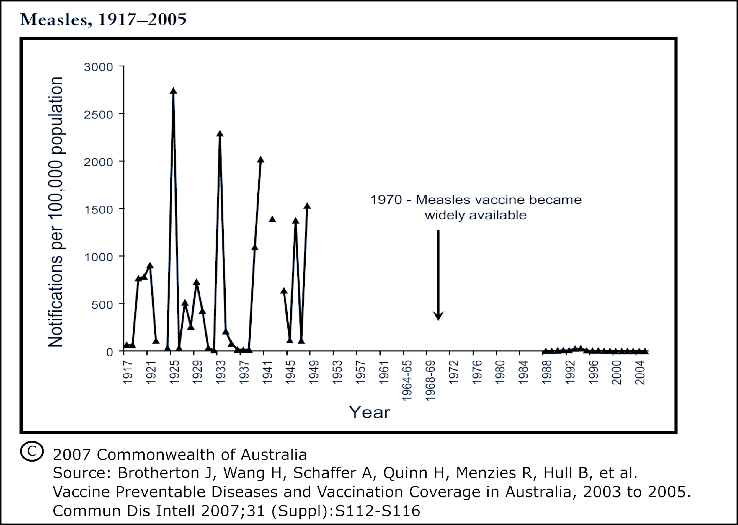
Here is an excerpt of Beattie’s commentary about this:
“In the case of measles, we immediately see that 40 years of data is missing surrounding the introduction of the vaccine. Notifications were not compiled nationally from 1949 to the mid-1980s when the National Campaign Against Measles began. Even the data prior to 1949 is scanty. Measles was not a notifiable illness in most states.” – Greg Beattie: Fooling ourselves on the fundamental value of vaccines.
An Honest Appraisal of the Weakness and Unreliability of Notifications of Incidence Data Straight from a Vaccine Apologist
Let me show you how we can get an honest opinion from the vaccinationists themselves about notifications of incidence data:
If a morbidity data set shows what the vaccinationists want to see, they of course are happy to take it at face value, but all it takes to get the vaccinationists to speak plainly about the unreliability of the notifications of incidence data, is a morbidity data set that they are none to happy about, like this one:
Figure 19

Figure 19 is a screenshot from this document from the Spanish website VacunacionLibre.org. This graph juxtaposes mortality and morbidity data for measles (sarampión) in Spain. The bar graph is the death data and the line graph is the notifications of incidence data. The measles vaccine program was introduced in Spain beginning in 1978, * and the MMR Vaccine in 1981 (MMR vaccine in Spanish is Triple Vírica [triple virus] = TV for short, as seen in figure 19). The data source is the Statistical Year Books of Spain (Anuarios Estadísticos).
(*An earlier measles vaccine pilot program was implemented in Spain in 1968 but was suspended in 1970 due to high levels of adverse vaccine reactions.)
Here we can see that for Spain also, almost all the reduction in measles deaths occurred before the introduction of the measles vaccine. Here too we see that notifications of incidence for measles in Spain hold relatively steady and do not plummet as does mortality. In fact, notifications of measles incidence data reached all-time highs in Spain after measles deaths had reached all-time lows. The two data sets diverge, one from the other, almost completely.
The vaccinationists will of course credit any decline after the introduction of the vaccine, to the vaccine, but the notifications of incidence data for Spain does pose a problem for the vaccinationists:
The highest number, by far, of measles notifications of incidence for Spain happens in the year 1983, six years after the introduction of measles vaccines in Spain. The second highest year for measles notifications in Spain is the year 1986 by which point right around 400,000 thousand doses of measles vaccine were being given each year, and that in a nation where live births had dropped to around 450,000 a year.
(You can verify these numbers in the Statistical Yearbooks of Spain or more easily in this document here from the Carlos III Health Institute – No worries if you don’t read Spanish as I can walk you to the relevant pages and save you some time with the following instructions. Besides it’s mostly numbers, just remember that they use the period like we use a comma when writing numbers:
Yearly number of live births on page 35 [under the column – natalidad] of the Carlos III document.
Measles notifications of incidence on page 191.
Measles vaccine doses administered per year on page 238. Remember to add the columns for both sarampión/measles vaccination by itself, and the column for measles with mumps and rubella, the “Triple V” [MMR] to get the total measles vaccine dosage per year.)
Compare the Spanish mortality and morbidity data (above in Figure 19 of this essay) to the US mortality and morbidity data (Figure 16). Vaccinationists claim that the plummet in the notifications of incidence data in the US is due to the measles vaccine, even though the measles vaccination rate in the US was only around 60% in the first years of MMR in the late 1960s (I haven’t found documentation of measles vaccine coverage before MMR).
Then in Spain we see not only the two highest ever years for measles notifications of incidence well after the introduction of measles vaccines, we see that the second of these two worst years for measles notifications of incidence comes after measles vaccinations have reached around 8 doses per 9 children born*; a higher vaccination rate than the vaccination rate in the US which allegedly caused the plummet in notifications of incidence in the US.
*(the measles vaccine is generally given at 12 to 15 months, and 9 months during the beginning of the vaccination program in Spain, so the number of children born one year gives us the approximate number of children the following year for whom the vaccine is recommended. Initially the Spanish vaccine program would have had catching up to do for the unvaccinated children under 11 born in previous years, but by 1986 the program had already been in place for nine years)
Let us be consistent: if we credit the low measles notifications numbers following vaccination as directly attributable to the vaccine in the US, then why don’t we also attribute the worst years ever for notifications of incidence following the vaccine in Spain as directly attributable to the measles vaccine?
Clearly the vaccinationists would not be okay with that, so how then do Spanish Vaccine Apologists deal with the Spanish measles notifications of incidence data?
In the paperback, 2018, third printing of the book EN DEFENSA DE LAS VACUNAS (In Defense of Vaccines) by the Spanish pediatrician and Vaccine Apologist – Carlos González, we find several pages, from page 179 to page 184 dedicated to faulting Spanish Vaccine Apostates for pointing out that the highest ever numbers of notifications of incidence occurred well after the initiation of the Spanish measles vaccine program.
González explains, on page 183:
“The declared cases of measles, during the time in which it (measles) was very common, were always underestimated: when a doctor sees dozens of cases, it is easy to forget to declare a good part of them. When vaccination was introduced, the issue would have been discussed. The doctors were sure to receive information about measles and its importance, and they talked about it in the press and even on TV. Doctors probably took more care in reporting the measles cases they saw. Therefore, the incidence figures after the start of vaccination probably remained undervalued, but are closer to reality than the previous ones. That is, the peak we see in the graph is because yes, there was an epidemic of measles, but also that they (the doctors) put more care into trying to declare all cases.”
And here is the original Spanish for those who would like to double check it lest anyone accuse me of translating unfavorably.
“Las cifras declaradas del sarampión, en la época en que era muy frequente, estaban siempre infravaloradas: cuando un médico ve docenas de casos, es fácil que se olvide de declarar una buena parte. Cuando se introdujo la vacunación debió de hablarse del tema. Seguro que los médicos recibieron información sobre el sarampión y su importancia, y se habló en la prensa y hasta en la tele. Probablemente los médicos pusieron más cuidado en declarar los casos de sarampión que veían. Por lo tanto, las cifras de incidencia tras el inicio de la vacunación probablemente siguen estando infravaloradas, pero son más próximas a la realidad que las anteriores. Es decir, el pico que vemos en la gráfica se debe a que sí, hubo una epidemia de sarampión, pero también a que se puso más cuidado en intentar declarar todos los casos.”
And that is how Spanish Vaccine Apologists deal with those inconvenient spikes in measles after the vaccine program started: they simply point to the unreliability of notifications of incidence data, and note that you can’t take it at face value; according to González the highest years ever for measles notifications of incidence in Spain, may really not have been any higher than previous years, and could simply be attributable to measles being hyped more during those years.
That’s what I mean; to get a frank admission of the weakness and unreliability of the notifications of incidence data from the vaccinationists, just listen to them explain away a notifications of incidence data set that shows something they don’t like.
2 – Differences Between Mortality and Morbidity Data Revisited
In Part 1, of this essay series we went over the terminology of Mortality, Death, Morbidity, and Notifications of Incidence. I emphasized keeping the differences between them in mind; let’s expand on that:
Difference in Relevance
Mortality data is the relevant data source for evaluating and placing in context the central misconception of The Doctrine of Salvation Through Vaccination:
The belief that vaccines played a primary role in causing the drastic decline in deaths attributed to infectious disease in general, and many major diseases in particular, that occurred in the late 19th and early 20th centuries, especially as this relates to the plummet in infant and child mortality rates; and also, the corollary belief that, these diseases would return with comparable devastation if we stopped vaccination against them.
One dozen case examples of Vaccine Evangelists promoting this misconception were provided in the first installment of this essay series, Part 1: The Evangelists, in Exhibits A through L.
The preaching of the Vaccine Evangelists such as the Graveyard Gambit, the Bait and Switch Preaching, and the Lifespan Lecture, cannot be verified, nor falsified, nor placed into context through notifications of incidence data, but it can be through mortality data. Because they are preaching about lives saved through vaccination, and the number of lives lost to infectious diseases before vaccination, they need the death data to support the belief that they are promoting.
As I wrote in Part 1: The Evangelists:
Morbidity data would be icing on the cake of that belief, but the belief is indefensible to begin with if the mortality data doesn’t support it (in which case there is no cake to put the icing on).
Difference in Gravity/Severity
This is quite straightforward, and needs no further elucidation, so I’ll just quote myself from Part 1 as a refresher for the reader.
Experiencing an illness (morbidity), which might be very mild, and may not result in any lasting complications, is very different from experiencing death (mortality) which means the end of your earthly visit, and the defunction of all the bodily functions of your physical body. There is no “mild death.”
Morbidity might lead to mortality or it might not even remotely head that way; these are two potentially and often radically different conditions. Morbidity could refer to just about any condition, including something very temporary, that results in something just shy of excellent health, but is still a literal lifetime away from death.
Difference in Completeness
Many of the historical, death by cause of death, data sets, are mostly complete data sources, in that most the deaths were recorded for the areas represented in many of the data sets:
Here is an example; the 1920 Mortality Statistics of the United States by the Bureau of the Census specifies on page 10 that states and cities had to have nearly complete death registration, recording at least 90% of deaths in order to be included in the United States death registration area. That’s not to say that they actually did successfully achieve 90% registration of deaths, we probably won’t know for sure, and their methods for gauging completeness may have been faulty, but it is evidence that death registration data was held to standards that notifications data was and is not. At least some demonstration of completeness was required for the death data to be considered worthy of inclusion in the yearly statistics.
Some places achieved nearly complete death registration sorted by cause even in the 19th century; For example: Massachusetts as early as the 1850s is regarded as having had excellent registration of deaths. This paper, THE ACCURACY OF VITAL STATISTICS IN MASSACHUSETTS, 1842-1901 Gutman, Robert estimates that in 1855 Massachusetts was only failing to record 11% of deaths, which works out to 89% complete death registration, and on page three Gutman notes:
“by 1870, registration of deaths had become virtually complete” (for Massachusetts)
Notification of incidence data by comparison is very much incomplete: the CDC’s measles page, states that, prior to the vaccination program half a million measles cases were reported each year, but they also estimate that 3 to 4 million people actually got measles each year.
Using the CDC’s own estimation of the actual number of measles incidence (3 to 4 million) vs the reported number of measles cases (½ a million) we can see that only 1 out of 6, or 1 out of 8 incidences of measles were actually being reported.
For Spain also, the morbidity data is very much incomplete; González stresses how under reported incidence was multiple times. On page 182 of his book (En defensa de las vacunas, 2018 paperback third printing), he notes that while rare, grave diseases such as yellow fever, are well reported, mild cases of illnesses such as the flu and measles are not well reported. His own words are that:
“The official numbers are very underestimated, and only serve to show if tendency/prevalence, increases or decreases from one year to another.”
(And as before, here is the original Spanish to demonstrate that I translated fairly.
“Las cifras oficiales están muy infravaloradas, y solo sirven para ver la tendencia, si aumentó o disminuyó de un año a otro.”)
And as we saw, González regards the incidence notification data as not even necessarily accurate for the purpose of gauging year to year trends, for he noted that the record high years for notifications of incidence following measles vaccination in Spain may simply be because of increased news coverage, and messaging sent to doctors.
We should take note, though, that Gonzalez believes grave diseases are relatively well reported. In the US literature, we also find it noted that while “diseases such as measles are poorly reported,” diseases considered very serious do tend to be well reported, or at least that’s what the official documents claim (emphasis mine):
“The completeness of reporting communicable diseases varies from State to State and in different parts of the same State. Several variables influence the reporting of diseases. Certain so-called minor communicable diseases such as measles are poorly reported because a large proportion of the cases are never seen by a physician. The fact that few cases of measles have a fatal termination and because restrictive measures are minimum and no investigation of cases is made, also mitigates against complete reporting. On the other hand, a very high proportion of the potentially dangerous diseases such as smallpox, diphtheria, * and typhoid fever, are reported.”
Vital Statistics of the United States – 1950 Page 63, Chapter 4, Notifiable Disease Statistics.
[*Relevant to revisiting the CDC’s diphtheria deception at the end of this essay]
Isabella B, whose work of vaccine apologetics we are about to critically review as a case example, also notes the very much incomplete nature of notifications of incidence data in Graphical Proof that Vaccines Work. Regarding notifications of measles incidence in England, Isabella B writes (emphasis in the original);
“In the pre-vaccination period, when measles infection was universal, the number of actual cases would have been much higher than the number of reported cases, as only a fraction was reported to the public health care system during that time.”
The Vaccine Apostates, of course, are keenly aware of these differences in the data types; for example Greg Beattie in his book Fooling ourselves on the fundamental value of vaccines devotes multiple, very informative chapters, to a discussion of notifications of incidence data, and its shortcomings.
We can see that completeness is yet another major difference between the morbidity and mortality data, and the vaccinationists also acknowledge this (i.e., Isabella B and Carlos González above) even if they have a disturbing tendency to conveniently forget this difference most the time.
Difference in Availability
A notable quality of the notification of incidence data is that much of it is missing, because it was never collected to begin with for many of the most interesting and crucial times:
For England and Wales, we find the notification of incidence data for many of the diseases only gets us back to the 1940s, leaving us without corresponding notifications data for the period in which most the decline in mortality occurred. The mortality data in contrast is available from 1838 onwards.
For most the Spanish data, the notification of incidence data is not available nationally till the mid-1940s, leaving us without national notifications for the period in which most the 20th century decline in mortality occurred. By contrast death/mortality data sorted by cause is available for Spain back to 1900.
In the United States national notification of incidence data is not available until:
- 1912 for diphtheria, measles, typhoid, polio
- 1922 for whooping cough
- 1930 for tuberculosis
1912 is only 12 years later than the collection of national (but really – death registration area) yearly cause of death data in the US, but for a disease like diphtheria that’s a lot of missing data; over half the recorded US 20th century decline in diphtheria mortality happened before 1912, leaving us with no corresponding notification of incidence data for the period in which the greatest part of the 20th century plummet in diphtheria mortality occurred.
For Australia they were not consistently making many of these diseases notifiable at all. Figure 18 showed us the enormous amount of missing measles notifications of incidence data for Australia, here is another graph of Australian notifications of incidence data or lack thereof from Greg Beattie’s book Fooling ourselves on the fundamental value of vaccines, this one for whooping cough.
Figure 20

Beattie writes of the Australian whooping cough notifications of incidence data:
“With whooping cough, we see a 30-year gap where data was not compiled nationally. Prior to this, it came predominantly from one state (SA). In fact, examination of the raw data reveals it was not until 1982 in NSW, 1983 in NT, 1989 in Tasmania, and 1990 in Queensland that the illness was even notifiable.”
Availability as we can see, is another major difference between morbidity and mortality data with much of the morbidity data missing altogether.
Difference in Value for Severity of a Disease
Neither mortality nor morbidity data will show you the number of serious complications other than death attributed to a disease. Historical data sets comparable to mortality data in which nearly all serious disease injuries are listed year by year and sorted according to cause do not exist, or at least no one on either side of the debate knows where to find any such data set. Just in case such a data set is hiding somewhere unknown to nearly everyone, I emailed the CDC twice asking if they knew of any such data; months later I’m still awaiting a response (not that I expect one at this point).
We can, however, get a rough estimate of the serious complications burden of a disease by extrapolating from the data we do have, but only one of the data sets is suitable for that – death data. Prevalence of a disease (of which notifications of incidence data is used as a weak and unreliable gauge) is no indicator of the severity of the disease. Death, by contrast, most certainly is an indicator of severity.
Vaccine Apologists frequently do something that I call arguing from the data we don’t have. This involves downplaying the value of mortality data by pointing out that death is not the only serious outcome that a disease can cause. They then fault the Vaccine Apostates for not providing historical data on the rate of various serious disease complications other than death, and then they switch the conversation back to notifications of incidence data.
By appealing to the yearly historical data of serious complications other than death for various diseases, sorted by cause, the Vaccine Apologists give the impression that this data would support them if it existed. But they don’t provide this data . . . evidently because they can’t find it.
They will generally give estimates for the number of serious complications per thousand but provide no continuous series of complications data that would allow us to assess the pre-vaccine trend.
The reason Vaccine Apostates are not creating graphs of historical data for various serious complications other than death from different diseases is because, just like the Vaccine Apologists, the Apostates cannot find such data either.
That’s why I call it arguing from the data we don’t have when the Apologists fault the Apostates for not showing graphs of the data that the Apologists can’t find either.
There is, however, one serious disease complication for which do have extensive, historical data sorted by cause – death.
3 – Case Example #1 of Vaccine Apologetics – “Graphical Proof that Vaccines Work”
I hope you have had a chance to read Isabella B’s 2015 article Graphical Proof that Vaccines Work (Archive.is Version Here).
Here is some background before we get into the deconstruction of Isabella’s article: I first knew of Isabella B, whoever she may be, when reading critical reviews of the book Dissolving Illusions. I wanted to see how the book, Dissolving Illusions, stood up to criticism.
Some of the most detailed criticism at the time was actually on the Amazon reviews for the book. The most serious and skillfully argued critical review was one Isabella B had written. A lengthy debate ensued right there on the Amazon reviews for the book, between Isabella B and one of the Dissolving Illusions authors, in responses and counter responses to Isabella B’s review.
Isabella B followed this up by moving her criticism of the book out from the reviews section onto the general internet with the 2014 article Why Dr Suzanne Humphries, an anti-vaccine activist, is lying to you about measles, to which Humphries and Bystrianyk responded with Response to “Isabella B’s” “Why Dr Suzanne Humphries, an anti-vaccine activist, is lying to you about measles”
Isabella B then branched out from criticizing Dissolving Illusions into more general Vaccine Apologetics, published several articles in succession, and then apparently moved on and left the topic behind.
I chose Isabella B’s 2015 article Graphical Proof that Vaccines Work to have the honor of being Case Example #1 of Vaccine Apologetics for this essay series because:
- Her article provides an excellent tour of the Motte/overview of incident notifications data.
- It’s skillfully argued and clever.
- It is solidly representative of Vaccine Apologetics aimed at dismissing or downplaying death data; all the Apologists basically use slight variations of the same arguments Isabella B uses to get the attention away from the death data. And few of the Apologists are as skilled at this as is Isabella B.
- The continued relevance of Isabella B’s article is evidenced by the fact that it continues to be quoted from and linked to right up into the 2020s: Here, we see this article quoted Isabella with five excerpts strung together from her article to support the author’s point, Isabella’s article is linked to here in an our world in data page that was revised in 2022, or here on the immunization page of the Immunization Foundation of Australia which had to have been updated or created after 2020 based on the content and, and so on, and so forth.
- Suffice it say Isabella’s article has had a good run, and the article appears to still be alive and well (see above [4]). It has served the vaccinationists admirably, but it is well past time to put Isabella’s article out to pasture; I will now open the pasture gate and usher it through.
4 – General Critique of “Graphical Proof that Vaccines Work”
Lack of Documentation
Who is Isabella criticizing? She does not tell us, and does not provide documentation of her opponent’s claims. This leaves Isabella free to misrepresent her opponent’s claims by not allowing us to verify whether or not they are saying what she says they are saying.
Isabella does give us a clue, though, as to who she is likely criticizing when she singles out her principal target, or type of target (emphasis in the original):
“Proponents of the anti-vaccine movement will often plot death rates over time”
The death-rate graphs that circulate in the English-speaking sphere of the vaccine conflict are primarily by Bystrianyk and Humphries, and by Greg Beattie. Isabella B’s lack of documentation gives us no choice but to decide for ourselves whom she is criticizing; I deem it fair to judge Isabella’s claims against the work of Bystrianyk and Humphries, and Greg Beattie, as the most probable people who Isabella is taking aim at.
Repeatedly Commits Post Hoc Fallacies
Wikipedia gives a pretty good overview of a post hoc fallacy:
“The fallacy lies in a conclusion based solely on the order of events, rather than taking into account other factors potentially responsible for the result that might rule out the connection.”
“A occurred, then B occurred.
Therefore, A caused B.”
“The rooster crows immediately before sunrise; therefore, the rooster causes the sun to rise.”
Isabella treats a vaccine as having merely come into existence at some point before a decline in death or notifications as reason enough to conclude that the vaccine caused the decline in incidence or mortality from that point on.
The vaccine came into existence, then the notifications rate fell.
Therefore, the vaccine caused the fall in notifications.
There is no exploration or acknowledgment in Isabella’s article of other factors that could have caused the respective declines. No consideration is given, nor investigation made, into the most basic areas to look, such as possible changes in disease definition, reporting requirements, diagnostic criteria, or diagnostic bias.
5 – Point-by-Point Deconstruction of Isabella B’s “Graphical Proof that Vaccines Work” and Identification of the Rhetorical Maneuvers Employed Therein
The section under “Disease incidence is the correct metric” is misdirection
The most important rhetorical maneuver that Isabella makes in her entire article occurs in the first three paragraphs (emphasis in the original): visit us here
“The graphs in this article (showing disease incidence over time relating to several diseases and several countries) make a compelling case for vaccine effectiveness.
Proponents of the anti-vaccine movement will often plot death rates over time as “proof” that vaccines were introduced at a time when they had a negligible effect. However, mortality rates are the incorrect metric when evaluating vaccine effectiveness. Here’s why:
- Disease incidence is the correct metric. Since vaccines are designed to prevent the incidence of disease, rates of disease (morbidity) are the correct metric for evaluating vaccine effectiveness. If vaccines were a drug to treat disease, then case-fatality rates would be the correct metric for evaluation. Measuring vaccine effectiveness by looking at mortality rates only is a bit like measuring contraceptive effectiveness by measuring abortion rates only — it only tells a tiny part of the story.” – Isabella B – Graphical Proof that Vaccines Work
That right there was beautifully executed: every Vaccine Apologist has to figure out how to make the switch without alerting the mark; they have to substitute the bait from the Evangelists’ preaching about vaccines adding 30 years to our lifespan, and ending the age of cemeteries filled with little kids’ headstones, to the switch of “vaccines reduced notifications of incidence.”
They have to retreat from the death data Bailey into the notification of incidence Motte without it looking like they are ceding any ground or running for cover.
How did Isabella pull off that rhetorical maneuver? She employed a very basic technique that can be summed up in the following statement.
This saw is no good because it doesn’t hammer nails.
The saw may be no good for hammering nails, but if what you want to do is saw wood than the saw is appropriate.
Fault a tool if it doesn’t do what it is supposed to do. Don’t fault a tool for not doing what it wasn’t meant for to begin with.
Isabella B is faulting the death-rate graphs for not being the appropriate tool for “evaluating vaccine effectiveness.” Her argument against the relevance of the death-rate graphs is based on the premise that the principal purpose of these graphs is to evaluate vaccine effectiveness. But this is not the principal purpose of death-rate graphs.
While some of the historical death-rate graphs can be used as an indicator of vaccine effectiveness in certain instances, the primary purpose of the death-rate graphs is to remove undue credit from vaccines by demonstrating what vaccines did not do.
Whether or not vaccines are effective, and whether not vaccines did what they are claimed to have done, are two separate questions.
Q – What primarily do Vaccine Apostates use death-rate graphs for?
A – To remove undue credit from vaccines by demonstrating what vaccines did not do.
Most of the death-rate graphs we have looked at do not tell you whether or not the vaccines in question work. What these graphs do show you is what the vaccines in question did not do. For example, the US measles death-rate graph demonstrates that the measles vaccine did not cause the greater than 98% plummet in the measles death rate that occurred before 1963, because that decline occurred before the vaccine’s introduction.
We have seen that, contrary to all the Vaccine Evangelism we reviewed in the first installment of this essay series (Part 1: The Evangelists Exhibits A through L), vaccines did not add 30 years to our lifespan, vaccines are not the reason we no longer have graveyards regularly peopled by children taken by childhood diseases, and vaccines are not the reason the USA no longer has 9,000 pertussis deaths a year.
The death-rate graphs are an effective tool for dispelling such misconceptions and debunking Vaccine Evangelist preaching.
Did Bystrianyk and Humphries call their book “Evaluating Vaccine Effectiveness” ? No, they called it Dissolving Illusions: Disease, Vaccines, and The Forgotten History.
They dissolved illusions about vaccines, by showing through overlooked historical information that vaccines had received undue credit for accomplishments that had been caused by other factors. One of their tools for removing this undue credit from vaccines was death-rate graphs showing us what vaccines did not do.
Greg Beattie in turn opens his book Fooling ourselves on the fundamental value of vaccines with a detailed example of Vaccine Evangelists preaching the Graveyard Gambit in which vaccines are credited for the improvement in child mortality from what it was in the 19th Century.
Beattie makes it very clear that he is using the death-rate graphs to refute the type of misconception evident in the Graveyard Gambit example that he provided, by demonstrating what vaccines did not do.
Beattie goes on to explicitly state, on page 13 of his book:
“These graphs do not make any attempt whatsoever to measure the performance of a vaccine. They simply put things into historical perspective for us. This perspective illustrates that vaccines were unimportant influences in the bigger picture; that they arrived too late to be considered potential contributors of any significance.
In Chapter Three we will examine (under a microscope) the contribution that vaccines made to the tail end of the declines. For now, let us simply acknowledge that, in historical perspective, vaccination made little if any contribution to the decline in deaths from each illness.”
The Vaccine Apologists cannot acknowledge the principal purpose of these graphs no matter how obvious it is what these graphs are being used for. The reason they can’t acknowledge this is because clearly these graphs are an effective tool for doing what they are intended for. The only way to judge death-rate graphs to be irrelevant or inapplicable, is to judge them by their usefulness as a tool for something that is not their primary purpose.
The Vaccine Apostates are using a saw to saw wood. The Apologists have no way to dismiss the appropriateness and effectiveness of the saw other than by faulting the saw for not hammering nails.
With care the Apologists can pull off this sleight of hand sufficiently well to fool unwary readers.